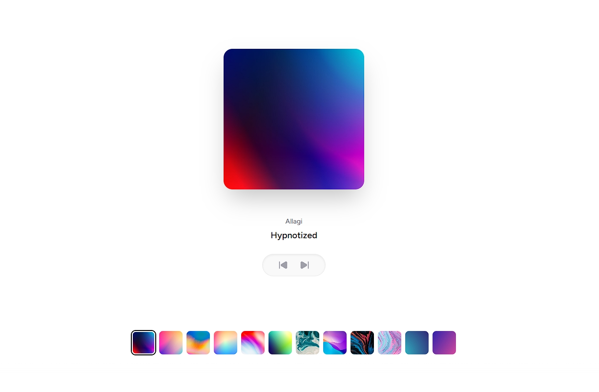
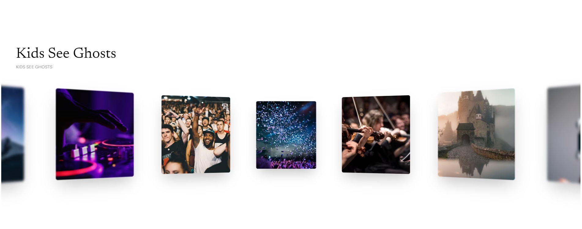
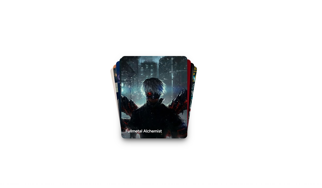
Expandable Cards
A responsive, zero-dependency expanding editorial gallery with smooth flex proportions, keyboard navigation via roving tabindex, and clean typography.


Examples
Custom Proportions & Curated Collection


Installation
$ npx shadcn@latest add https://akshitr.com/r/expandable-cards.json
Usage
import ExpandableCards from "@/components/expandable-cards";

export default function Example() {
  return (
    <ExpandableCards
      defaultIndex={2}
      expandedFlex={5.2}
      collapsedFlex={1}
      height="h-[480px]"
    />
  );
}
Props
| Prop | Type | Default | Description |
|---|---|---|---|
items | ExpandableCardItem[] | DEFAULT_ITEMS | List of items with src, alt, title, and optional tags. |
defaultIndex | number | 2 | Index of the card expanded by default on first mount. |
expandedFlex | number | 5.2 | CSS flex proportion assigned to the active expanded card. |
collapsedFlex | number | 1 | CSS flex proportion assigned to the collapsed sliver cards. |
height | string | "h-[480px]" | Tailwind height utility class for the gallery track. |
onSelect | (index: number, item: ExpandableCardItem) => void | - | Callback fired when a card is clicked or keyboard-navigated. |
Use Cases
- Case Study & Work Showcase: Display editorial projects where hovering or arrow-navigating expands full imagery, tags, and context.
- Editorial Features & Magazine Grids: Present headline stories, articles, or services in an accordion-like flex container without layout shifts.
- Team & Leadership Profiles: Highlight team members or contributors in a compact footprint with detailed focus on selection.
- Product Range & Spec Comparison: Compare product editions or design variants with smooth flex proportions and accessible roving tabindex.