Dock Gallery
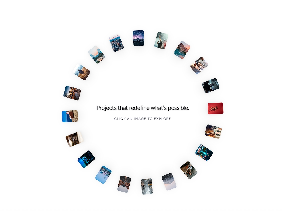
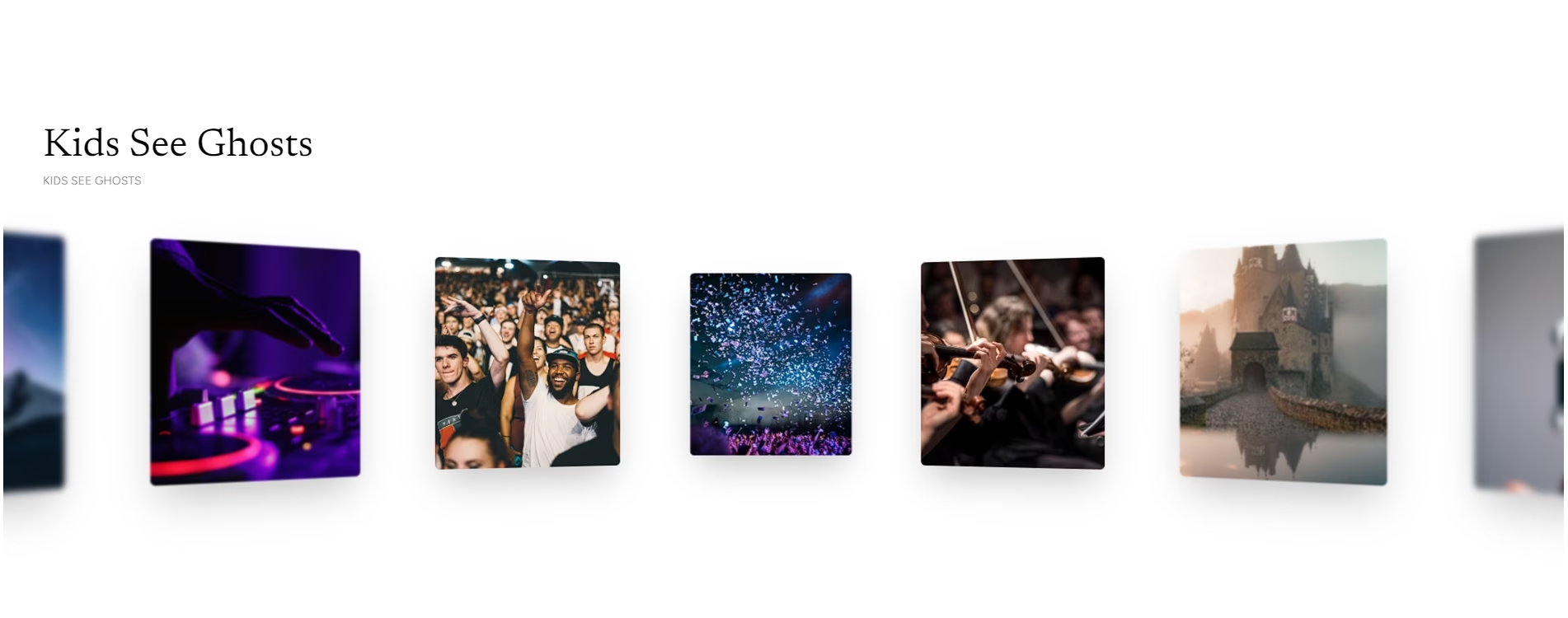
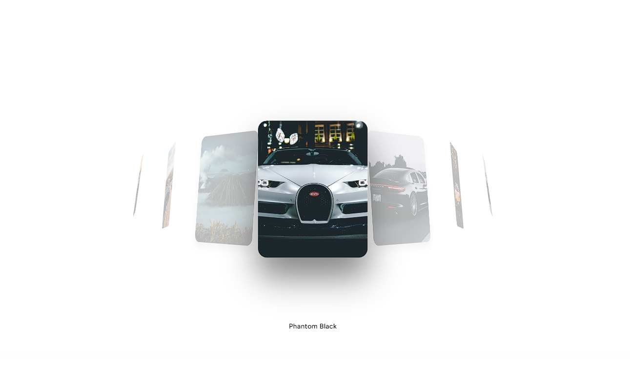
An interactive media gallery featuring direction-aware 3D card flips, keyboard navigation, and an interactive macOS-style thumbnail dock.












Installation
$ npx shadcn@latest add https://akshitr.com/r/dock-gallery.json
Usage
import DockGallery from "@/components/dock-gallery";

const ALBUMS = [
  {
    id: 1,
    title: "Hypnotized",
    artist: "Allagi",
    cover:
      "https://images.unsplash.com/photo-1614850523459-c2f4c699c52e?w=500&q=80",
  },
  {
    id: 2,
    title: "Midnight City",
    artist: "M83",
    cover:
      "https://images.unsplash.com/photo-1614849286521-4c58b2f0ff15?w=500&q=80",
  },
  {
    id: 3,
    title: "Currents",
    artist: "Tame Impala",
    cover:
      "https://images.unsplash.com/photo-1550859492-d5da9d8e45f3?w=500&q=80",
  },
  {
    id: 4,
    title: "Starboy",
    artist: "The Weeknd",
    cover:
      "https://images.unsplash.com/photo-1579546929518-9e396f3cc809?w=500&q=80",
  },
];

export default function Demo() {
  return <DockGallery items={ALBUMS} />;
}
Custom Renderers
You can completely replace the artwork view, metadata/controls area, and dock thumbnail faces with your own custom React components using renderArtwork, renderInfo, and renderThumbnail
Component API
DockGallery
| Prop | Type | Default | Description |
|---|---|---|---|
| items? | T[] | — | Array of items to render in the gallery. |
| defaultIndex? | number | 0 | Initially active index on mount. |
| className? | string | — | Additional CSS classes for the root container. |
| artworkClassName? | string | — | Additional classes for the top 3D artwork frame. |
| dockClassName? | string | — | Additional classes for the bottom dock thumbnails strip. |
| enableKeyboard? | boolean | true | Enables left and right arrow key navigation. |
| showControls? | boolean | true | Shows the next and previous skip button pill. |
| showInfo? | boolean | true | Shows title and subtitle/artist metadata. |
| thumbnailBaseSize? | number | 48 | Idle size of dock thumbnails in pixels. |
| thumbnailHoverSize? | number | 96 | Peak expanded thumbnail size in pixels on hover. |
| renderArtwork? | (item: T, activeIndex: number) => React.ReactNode | — | Custom render function for the main display card. |
| renderInfo? | (item: T, activeIndex: number, controls: { next, prev }) => React.ReactNode | — | Custom render function for the info & controls section. |
| renderThumbnail? | (item: T, index: number, isActive: boolean) => React.ReactNode | — | Custom render function for thumbnails inside the dock. |
| onActiveChange? | (index: number, item: T) => void | — | Callback fired when the active media item changes. |
DockGalleryItem
| Prop | Type | Default | Description |
|---|---|---|---|
| id | string / number | — | Unique identifier for the item. |
| title? | string | — | Main title displayed in the info section. |
| subtitle? | string | — | Subtitle or secondary artist credit. |
| artist? | string | — | Alias for subtitle. |
| cover? | string | — | Image URL for the artwork and thumbnail. |
| image? | string | — | Alias for cover. |
| src? | string | — | Alias for cover. |
Interactions & Features
- Direction-Aware 3D Card Transitions: Navigating forwards tilts and animates cards from the right, navigating backwards slides and rotates them from the left with spring physics.
- Interactive Fisheye Dock: Cursor proximity smoothly magnifies adjacent thumbnails like the macOS dock using continuous spring interpolation.
- Keyboard Shortcuts: Built-in left and right arrow key navigation (
←and→).
Use Cases
- Audio Players & Music Streaming UIs: Recreate modern desktop music player interfaces with cover art flip and tactile album scrubbing.
- Portfolio Artwork & Asset Previews: Allow clients to browse graphic design iterations, 3D renders, or UI snapshots via an Apple-style dock.
- E-Commerce Product Color/Variant Viewers: Switch between product angles and colorways with instant visual feedback and thumbnail magnification.
- Interactive Photography Viewfinders: Deliver a premium desktop media browsing experience with keyboard navigation support.