Momentum Carousel
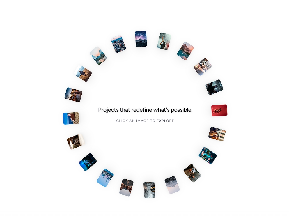
A 3D concave cylindrical carousel driven by continuous spring physics, dynamic velocity scale-down, and snappy momentum drag and wheel interactions.



Examples
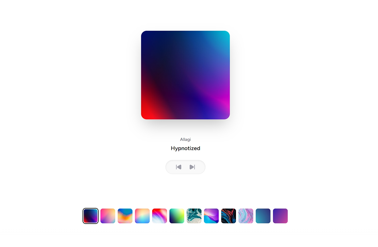
Custom Header and Card Content
Customize both the animated active item header via renderHeader and the 3D card layout via renderCard with badges, playback indicators, or bespoke card themes.
Installation
$ npx shadcn@latest add https://akshitr.com/r/momentum-carousel.json
Usage
import MomentumCarousel from "@/components/momentum-carousel";

const ALBUMS = [
  {
    id: 1,
    title: "Hypnotized",
    artist: "Allagi",
    cover:
      "https://images.unsplash.com/photo-1614850523459-c2f4c699c52e?w=500&q=80",
  },
  {
    id: 2,
    title: "Midnight City",
    artist: "M83",
    cover:
      "https://images.unsplash.com/photo-1614849286521-4c58b2f0ff15?w=500&q=80",
  },
  {
    id: 3,
    title: "Currents",
    artist: "Tame Impala",
    cover:
      "https://images.unsplash.com/photo-1550859492-d5da9d8e45f3?w=500&q=80",
  },
  {
    id: 4,
    title: "Starboy",
    artist: "The Weeknd",
    cover:
      "https://images.unsplash.com/photo-1579546929518-9e396f3cc809?w=500&q=80",
  },
];

export default function Demo() {
  return <MomentumCarousel items={ALBUMS} />;
}
Component API
MomentumCarousel
| Prop | Type | Default | Description |
|---|---|---|---|
| items? | T[] | — | Array of items to display in the carousel. |
| albums? | T[] | — | Backwards compatibility alias for items. |
| showHeader? | boolean | true | Whether to display the animated title/subtitle in the top corner. |
| className? | string | — | Additional CSS classes for the outer container. |
| cardClassName? | string | — | Custom class names for each 3D card element. |
| renderHeader? | (activeItem: T, index: number) => React.ReactNode | — | Custom render function for the header content. |
| renderCard? | (item: T, index: number) => React.ReactNode | — | Custom render function for the inner card face. |
| onActiveChange? | (index: number, item: T) => void | — | Callback triggered whenever the center card changes. |
MomentumCarouselItem
| Prop | Type | Default | Description |
|---|---|---|---|
| id | string / number | — | Unique identifier for the item. |
| title? | string | — | Primary title shown in the header. |
| subtitle? | string | — | Secondary subtitle or artist name. |
| artist? | string | — | Alias for subtitle. |
| cover? | string | — | Image URL for the card face. |
| image? | string | — | Alias for cover. |
Features
- 3D Concave Ring: Inside-out 3D perspective where center items sink backward and side cards flare forward and curve toward the viewer.
- Dynamic Scale-Down on Velocity: During rapid dragging or wheel scrolling, the entire carousel dynamically scales down with an organic breathing cushion effect.
- Throw & Flick Momentum: Calculates drag release velocity and smoothly throws cards forward before snapping cleanly to the nearest card center.
- Mobile Responsive: Dynamically tightens card spacing, adjusts 3D perspective, and optimizes swipe sensitivity for mobile viewports with
touch-pan-ysupport.
Use Cases
- Album & Media Discography Browsers: Recreate modern Apple-like Cover Flow experiences with tactile flick physics and smooth snapping.
- Flagship Project Carousels: Present curated case studies or client engagements in full-width landing page showcases.
- Film, Game & Entertainment Displays: Let users scrub through movie trailers, game characters, or event posters with high visual drama.
- Fashion Lookbooks & Catalogs: Showcase editorial campaigns and apparel lookbooks with physics-driven inertia.