Cover Flow Carousel
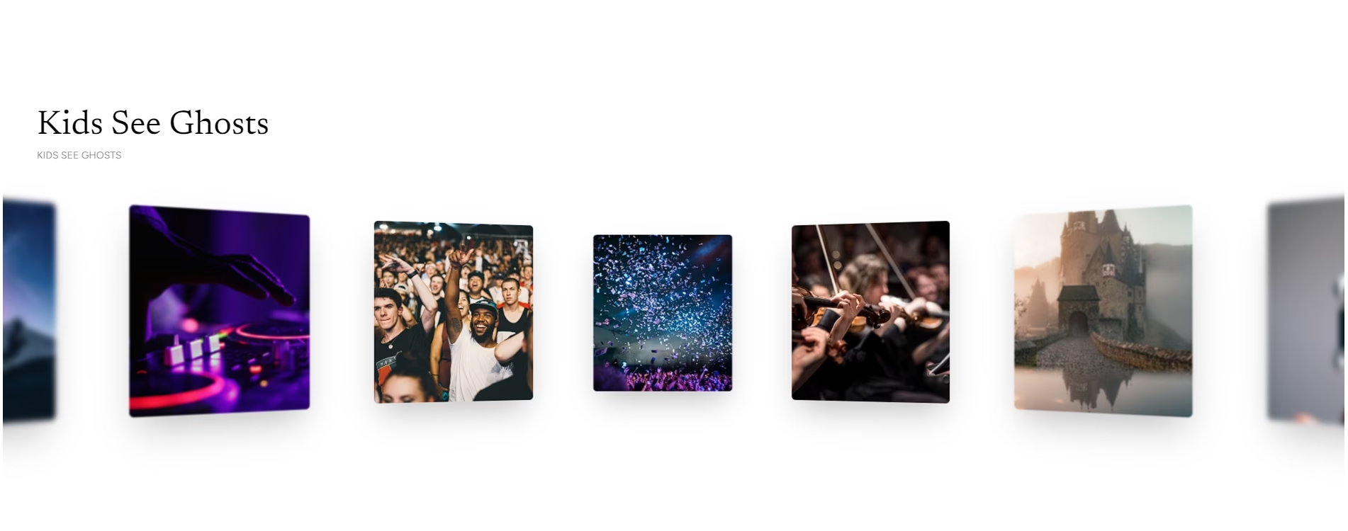
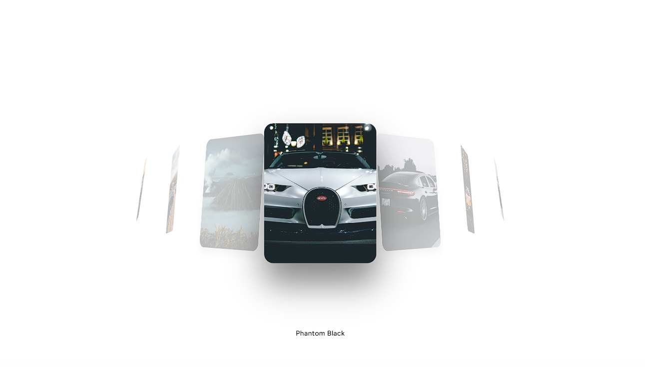
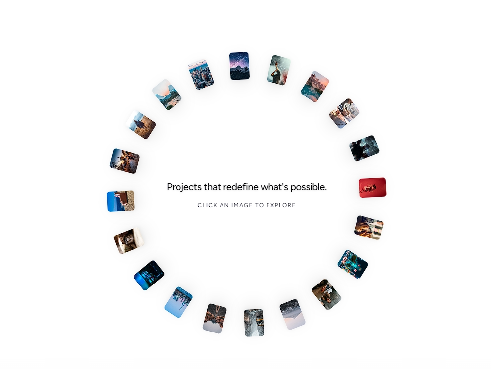
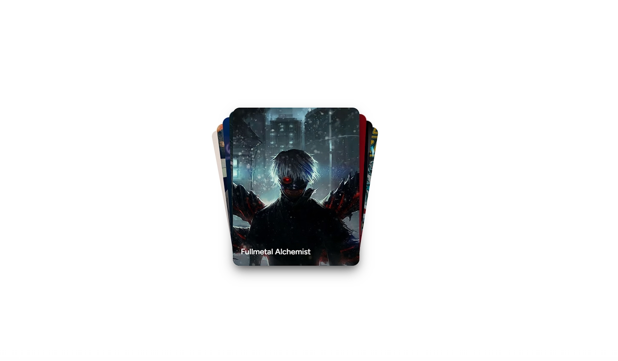
An infinite 3D perspective cover flow carousel featuring fluid spring physics, drag momentum, circular looping, and distinct layout presets.


Installation
$ npx shadcn@latest add https://akshitr.com/r/cover-flow-carousel.json
Usage
import CoverFlowCarousel from "@/components/cover-flow-carousel";

export default function Example() {
  return (
    <CoverFlowCarousel
      preset="coverflow"
      autoplay={true}
      autoplayInterval={3500}
      pauseOnHover={true}
    />
  );
}
Presets
The carousel includes 5 meticulously tuned 3D spatial presets ("coverflow", "classic", "stack", "flat", "dramatic") altering the wing angle, lateral card spread, Z-depth recession, and lighting occlusions.
Props
| Prop | Type | Default | Description |
|---|---|---|---|
items | CoverFlowItem[] | DEFAULT_COVERFLOW_ITEMS | Array of carousel slide items with id, title, subtitle, and image. |
preset | "coverflow" | "classic" | "stack" | "flat" | "dramatic" | "coverflow" | 3D spatial preset controlling angle, spacing, scale, and depth. |
initialIndex | number | 2 | Index of the card selected on initial mount. |
cardWidth | number | 300 | Base width of the cards in pixels. |
cardHeight | number | 310 | Height of the artwork image inside the card in pixels. |
mobileScale | number | 0.72 | Scale multiplier automatically applied on viewports < 640px. |
autoplay | boolean | true | Automatically advance slides on an interval. |
autoplayInterval | number | 3000 | Duration in milliseconds between auto-advancements. |
pauseOnHover | boolean | true | Pause autoplay when the mouse hovers over the stage. |
onChange | (item: CoverFlowItem, index: number) => void | - | Callback fired whenever the active card changes. |
Use Cases
- Featured Work & Case Studies: Give portfolio hero sections an iconic, interactive centerpiece where visitors can flick through selected projects.
- Album & Discography Showcases: Pay homage to classic Apple Cover Flow for music artists, podcasters, and record labels.
- Product & Apparel Catalogs: Present footwear, gadgets, or capsule collection lookbooks with realistic 3D perspective and depth cues.
- Entertainment & Media Carousels: Browse game rosters, streaming movie titles, or festival event lineups with cinematic presets.