Floating Nav
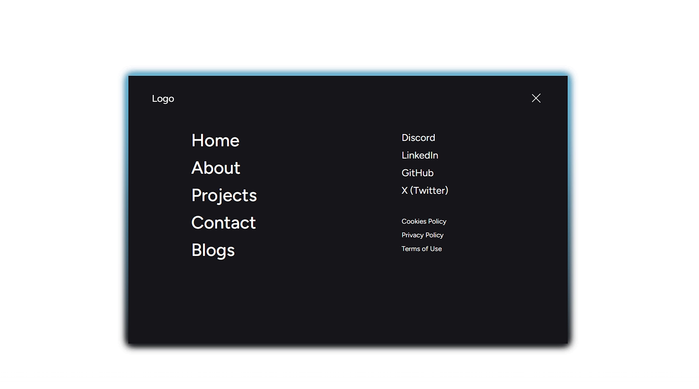
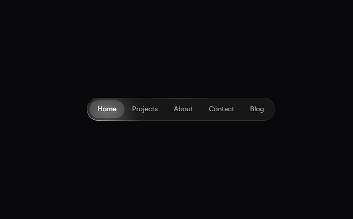
An elegant, morphing pill navigation bar with fluid spring physics, outside-click close detection, and staggered entrance links.
Click Menu below to toggle the floating navigation bar.
Installation
$ npx shadcn@latest add https://akshitr.com/r/floating-nav.json
Usage
import FloatingNav from "@/components/floating-nav";

export default function Example() {
  return (
    <FloatingNav
      links={[
        { label: "Home", href: "#" },
        { label: "Work", href: "#" },
        { label: "About", href: "#" },
        { label: "Contact", href: "#" },
      ]}
      socials={[
        { label: "GitHub", href: "https://github.com" },
        { label: "Twitter", href: "https://twitter.com" },
      ]}
      position="bottom"
    />
  );
}
Props
| Prop | Type | Default | Description |
|---|---|---|---|
links | FloatingNavLink[] | DEFAULT_LINKS | Navigation links rendered inside the expanded menu body. |
socials | FloatingNavSocial[] | DEFAULT_SOCIALS | Secondary social media links with external arrow icons. |
position | "top" | "bottom" | "bottom" | Pin navigation to viewport top or bottom edge. |
initialOpen | boolean | false | Initial expanded state on mount. |
Use Cases
- Mobile & Desktop Sticky Navigation: Replace static headers with an unobtrusive floating bottom pill that cleanly expands on demand.
- Portfolio & Agency Navigation: Give creative sites a polished, interactive menu with staggered link entrances and social links.
- Doc & Tool Quick-Action Bar: Provide quick navigation links or shortcuts that float above long-scroll documentation pages.
- App Drawer & Contextual Menu: Serve as a floating contextual control bar with click-outside dismissal and spring transitions.