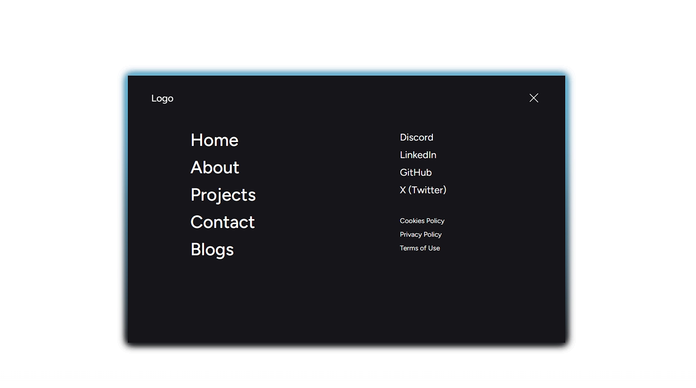
Glowing Desktop Nav
A modern navigation component with animated pill indicator, accent-aware gradients, and glow effects.
Examples
Custom Nav Items and Accent Color
Installation
$ npx shadcn@latest add https://akshitr.com/r/glowing-nav.json
Usage
import { GlowingNav } from "@/components/glowing-nav";

export default function GlowingNavDemo() {
  return (
    <div className="flex items-center justify-center">
      <GlowingNav />
    </div>
  );
}
Component API
| Prop | Type | Default | Description |
|---|---|---|---|
| items? | NavItem[] | DEFAULT_ITEMS | Array of navigation items with label and href. |
| defaultActive? | string | — | Label of the initially active item. |
| accent? | string | "white" | Any valid CSS color value for the glow and pill tint. |
| className? | string | — | Additional classes applied to the <nav> wrapper. |
| onNavigate? | (item: NavItem) => void | — | Callback fired when an item is selected. |
Use Cases
- Sticky SaaS Topbars: Add an ambient, futuristic header bar that follows users throughout dark-themed apps.
- In-Page Anchor & Section Tabs: Switch between tabs, documentation sections, or product features with smooth sliding pill animations.
- Developer Portfolio Navbars: Elevate personal site navigation with subtle glows and tactile indicator physics.
- Dashboard Filter Toolbars: Toggle between status views (e.g., All, In Progress, Completed) in a sleek dark interface.