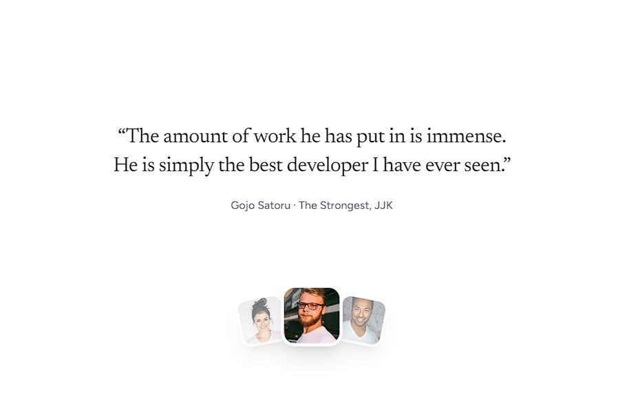
Animated Avatar Group
A dynamic avatar facepile stack that smoothly rotates and cycles through users with staggered animations and hover tooltips.

Gojo SatoruThe Strongest @ JJK

Alex MartinezCTO @ TechNova Solutions

Mikasa AckermanLead Engineer @ GlobalTech
Installation
$ npx shadcn@latest add https://akshitr.com/r/animated-avatar-group.json
Usage
import AnimatedAvatarGroup from "@/components/animated-avatar-group";

const USERS = [
  {
    name: "Gojo Satoru",
    role: "The Strongest",
    company: "JJK",
    avatar:
      "https://images.unsplash.com/photo-1599566150163-29194dcaad36?q=80&w=200&auto=format&fit=crop",
  },
  {
    name: "Alex Martinez",
    role: "CTO",
    company: "TechNova Solutions",
    avatar:
      "https://images.unsplash.com/photo-1507003211169-0a1dd7228f2d?q=80&w=200&auto=format&fit=crop",
  },
  {
    name: "Mikasa Ackerman",
    role: "Lead Engineer",
    company: "GlobalTech",
    avatar:
      "https://images.unsplash.com/photo-1494790108377-be9c29b29330?q=80&w=200&auto=format&fit=crop",
  },
  {
    name: "Sarah Chen",
    role: "Head of Product",
    company: "Helion Labs",
    avatar:
      "https://images.unsplash.com/photo-1438761681033-6461ffad8d80?q=80&w=200&auto=format&fit=crop",
  },
];

export default function Demo() {
  return (
    <AnimatedAvatarGroup
      users={USERS}
      visibleCount={3}
      interval={3000}
      label="Trusted by 2k+ people"
    />
  );
}
Component API
AnimatedAvatarGroup
| Prop | Type | Default | Description |
|---|---|---|---|
| users | AnimatedAvatarUser[] | — | Array of user objects to cycle through. |
| visibleCount? | number | 3 | Number of avatars simultaneously visible in the stack. |
| step? | number | 3 | How many avatars to advance on each interval. |
| interval? | number | 3000 | Auto-rotation interval in milliseconds. Set to 0 to disable rotation. |
| size? | string | "size-10" | Tailwind dimension class applied to each avatar circle. |
| label? | React.ReactNode | "Trusted by 2k+ people" | Content or badge text rendered next to the stack. Set to null to hide. |
| showTooltip? | boolean | true | Enables/disables the hover name, role, and company tooltip. |
| className? | string | — | Additional CSS class names for the outer container. |
AnimatedAvatarUser
| Prop | Type | Default | Description |
|---|---|---|---|
| name | string | — | User's full name. Displayed on tooltip. |
| avatar | string | — | Image URL for the avatar. |
| role? | string | — | Job title or role (e.g., "CTO"). |
| company? | string | — | Company or organization name (e.g., "TechNova"). |
Features
- Smooth Staggered Transitions: Avatars transition in and out with custom spring-eased motion and subtle blur effects.
- Tab Inactive Auto-Pause: Listens to the
visibilitychangeevent and automatically pauses the timer when the tab is hidden, preventing resource waste or skipped animations. - Hover Micro-Interactions: Hovering lifts the avatar with a subtle ring highlight and reveals a sleek dark/light floating tooltip with role and company tags.
Use Cases
- Social Proof in Hero Sections: Display real customers, contributors, or community members right below the primary CTA to drive conversion.
- Collaborative Workspaces: Show who is currently online or actively working in a multi-tenant dashboard or document editor.
- Community & Event Banners: Highlight speakers, recent signups, or attending members in registration flows.
- Team / About Pages: Showcase agile team pods, contributors, or board members with interactive bios on hover.