Progressive Blur
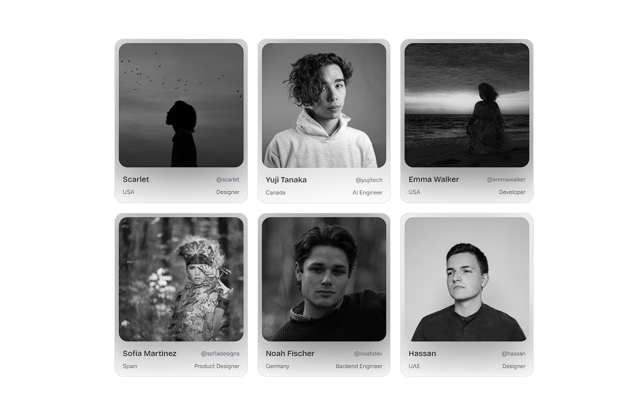
An overlay component that creates a soft, progressive blur effect on content below it, ideal for frosted glass designs.
Optical Frosted Glass
Mastering depth of field in modern web interfaces.
In the realm of digital design, depth is typically simulated through drop shadows and layering. However, one of the most sophisticated techniques for achieving a sense of physical space is the progressive blur.
Photographic Realism
Unlike a standard uniform blur, a progressive blur mimics the behavior of a physical camera lens. When an object moves out of focus, it doesn't instantly become a flat, homogeneous blur. Instead, the blur intensifies gradually, creating a soft, feathered edge that dissolves seamlessly into the background.
"By stacking overlapping masks and applying an exponential curve to the blur radius, we recreate optical physics in the browser."
The result is a frosted glass effect that feels incredibly tactile and premium. It completely eliminates the harsh banding often seen with basic CSS backdrop filters.
Functional Aesthetics
While progressive blur is undeniably beautiful, it also serves a functional purpose. In scrollable areas like fixed headers or sticky bottom navigation bars, a harsh cutoff can be visually jarring. A progressive blur softens this transition, allowing content to gently melt away as it scrolls underneath the overlay.
This technique anchors your interface elements without sacrificing spatial awareness. Users can still sense the content moving beneath, but their focus remains unobstructed. It's a subtle detail, but one that elevates the entire experience.
Installation
$ npx shadcn@latest add https://akshitr.com/r/progressive-blur.json
Usage
import ProgressiveBlur from "@/components/progressive-blur";

export default function ProgressiveBlurDemo() {
  return <ProgressiveBlur />;
}
Component API
ProgressiveBlur
| Prop | Type | Default | Description |
|---|---|---|---|
| className? | string | — | Additional classes applied to the root element. |
| position? | "top" | "bottom" | "bottom" | Position and direction of the blur ramp. |
| height? | string | number | — | Custom height (e.g. 100, "120px"). Defaults to responsive height (h-14 sm:h-18 md:h-24). |
| tint? | boolean | true | Blends a smooth optical color ramp using --background. |
Notes
Vignette Tint & --background
The component layers an optical multi-stop color-mix gradient over the blur using var(--background). This creates a smooth depth fade that melts scrollable content cleanly into the page background.
If you prefer pure optical frosted glass without any background color fade, you can disable it:
<ProgressiveBlur tint={false} />Use Cases
- Sticky Navigation & App Headers: Create seamless glassmorphic fade transitions that softly blur long scrollable page content under fixed headers.
- Floating Action Bars & Footers: Anchor bottom toolbars, checkout summaries, or playback controls with a polished gradual blur fade.
- Hero Image Overlays: Soften bottom edges of hero media or photography to guarantee crisp typography readability without hard color borders.
- Infinite Feeds & Carousel Edges: Blend scrollable container boundaries smoothly into ambient layout backgrounds.