Gooey Button
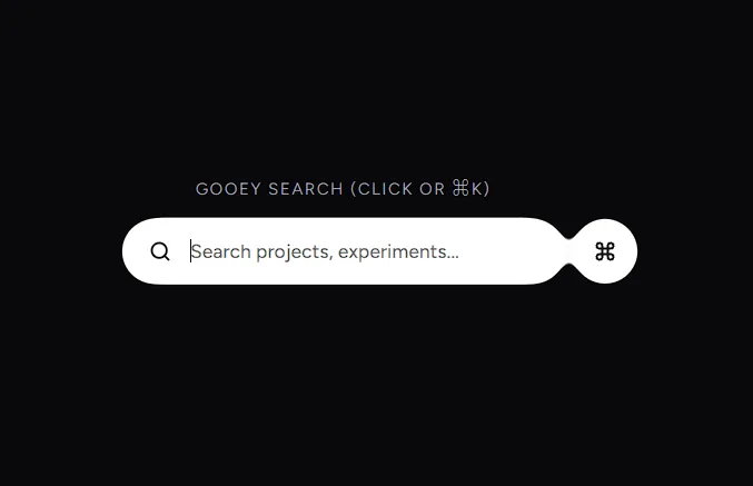
An organic liquid button interaction featuring an SVG color matrix goo filter, detaching trailing indicator, and spring animation.
Examples
As Link
Installation
$ npx shadcn@latest add https://akshitr.com/r/gooey-button.json
Usage
import GooeyButton from "@/components/gooey-button";

export default function Example() {
  return <GooeyButton>Explore more</GooeyButton>;
}
Props
| Prop | Type | Default | Description |
|---|---|---|---|
children | React.ReactNode | "Explore more" | Label text rendered inside the button pill. |
href | string | - | Optional destination URL. When provided, renders as a Next.js Link. |
target | string | - | Target attribute when used as a link (e.g. "_blank"). |
rel | string | - | Rel attribute when used as a link. |
icon | React.ReactNode | <ArrowUpRight /> | Icon displayed inside the detaching circle. |
separationDistance | number | 42 | Distance in pixels the indicator separates on hover. |
gooeyBlur | number | 6 | Gaussian blur radius applied to the SVG goo filter. |
Use Cases
- Playful Portfolio CTAs: Direct users to projects, contact forms, or resume downloads with organic liquid feedback.
- Conversion & Hero Action Buttons: Elevate primary conversion buttons with a tactile, satisfying detaching bubble interaction.
- Micro-Interactions for Creative Brands: Add distinctive personality to boutique studios, design systems, and creative tools.
- Interactive External Links: Provide responsive visual confirmation when directing users to external platforms or case studies.